Figure 1. Mind Games Effect [Illustration], from: Envato Elements, n.d.
What is psychology in media?
In a nutshell, it's when the media maker uses human psychology to illicit a planned or more importantly a chosen response from their audience. In very simple terms a successful pizza ad will make me want to eat pizza, a very good pizza ad will make me want to only eat their brand of pizza.
Right now, even reading the word pizza is likely making you think about how might actually want a slice right now too.
For me, psychology in the media is done best when I am so invested by the story that they are telling – that I want to know or have more.
When the message is blunt and thoughtless, I swipe, leave the cinema, change channels or block.
I am pretty practical when I am learning a concept. I like to break it down to its basic concepts and look at examples until I fully understand the theory.
I'll use product placement in movies as my example because this is something that drives me a little (make that a lot, actually) crazy if not done well and actually (when done badly) ruins movie scenes for me.
Here's one in Transformers 4 which is a bit too much for me, especially since it had two full screen shots for Beats by Dre Pill. It was just too staged and jarring – and worse, had nothing really to do with the storyline. It was especially the awkward way that Stanley Tucci had to hold it so that the logo was perfectly centred. That is certainly one way to make people not like your brand, it feels too pushy and makes me want to do anything but buy their product.
Figure 2. Product Placement in Transformers 4 [Video], by Smokydogy, 2014.
However, when it's done cleverly, I really like it. In this scene (below) in World War Z, after so much necessary silence to avoid attracting the zombies, Brad Pitt stops for a refreshing cold can of Pepsi – who wouldn't? And, in that clever moment of anticipation the viewer is hooked, as the cans collapse down in a huge crescendo he gets to prove his theory that he is now invisible to mummies. Brilliant.
It also showcases three of the 12 animation principals – anticipation (the audience knows what is going to happen but must watch anyway), staging (the machine, the cans, the way that Brad Pitt cracks the lid of the can and wipes his lips), and, last but certainly not least, appeal (I mean, everyone loves Brad Pitt).
Figure 3. World War Z Pepsi Scene [Video], by Endlflc, 2016.
I think that done well, using a human's inbuilt psychology to deliver your story makes complete sense, especially in the context of planning what you are making. Which of course means we need to have a solid understanding of what the key principals of human responses, needs and drivers are. Here, I would also add that knowing how to, and, when to use them can help you make much better content.
When I drill it down further, for me, it all really begins with your intent. What do you what to say and what do you want the audience to think, feel or even do after you finish your piece?
That is really where all good stories begin, what are you trying to say or show – and what is the best way of doing that?
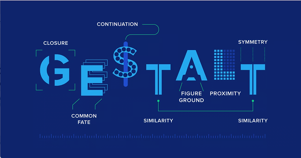
For me, it's about keeping it as simple as possible so that I can test a selection of the 12 animation principles, Gestalt six/seven principles (similarity, continuation, closure, proximity, figure/ground, and symmetry/order – and the newer concept of common fate) against what I am learning about Behaviourism.
If I do "A" knowing that a human will respond most likely with "B", can I tell a story with no colour or sound, using shapes?
I guess we are going to find out.
In light of everything I've learned in week one, I have decided to keep my two animations, in the spirit of the Heider and Simmel experiment, SIMPLE.
Figure 3.The Heider-Simmel Illusion [Video], by Heider and Simmel, from drwilliamashton [YouTube], 1944 / 2017.

Figure 4.Exploring the Gestalt Principles of Design [Illustration], by C. Chapman, from Designers, n.d.
Chosen Media Psychology Theory
I have decided to use Gestalt psychology principles for my two animations – this is because I like their logical nature.
Its name also says what it is, gestalt in German means configuration – or a group of things forming a whole. Apt, really. For me, the other important reason for picking the Gestalt theory and its principles is they ring true for how I experience the world. I see faces in clouds and make up stories in my head about people that I see on buses, imagining their names and the lives that they lead. It's human nature to want to complete and organise what we see so that is makes sense to us.
I also like that it says the human mind and our behaviour are connected and work together – or that our brains like to make things simple, if I see a group of monkeys together, I'll think they are related. Its direct theories resonate and make sense to me.

Figure 5.Related circles.
Similarity I want to test similarity by grouping my figures together to have the audience associate them together – as a family / couple / work colleagues.

Figure 6.Same path.
Continuation By moving the objects on similar paths, to the same destination, I want the viewer to accurately surmise that they are the same characters, do the same task, arriving at the same place.

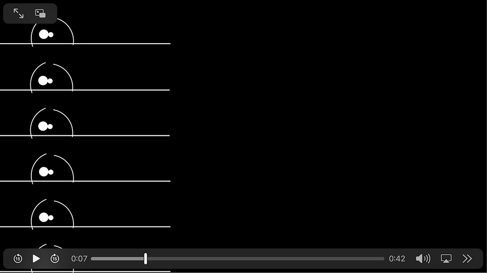
Figure 7.Closure.
Closure In having one scene fade into blackness and bringing the audience's attention to the school or work area, I hope to have them see it as one scene complete, moving from past to present.

Figure 8.Proximity.
Proximity Similar to how I hope that viewers will see same shapes as connected, I want them to see objects that interact closer together to be related – for Test A, mother / child / teacher, and for Test B, couple / workers / boss.

Figure 9.Symmetry and order.
Symmetry & Order In the case of the mother and child, by slightly overlapping the pair in their 'kiss / cuddle' and on the way to school, I believe that the viewers will see these two as distinctly different identities.

Figure 10.Common fate.
Common Fate I am hoping / thinking, that by having six circles essentially doing the same thing at the same time will help people see school children and workers.

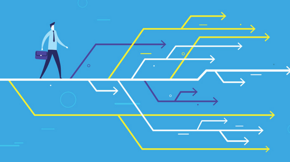
Figure 11. Scenario [Illustration], by Getty Images, from CFO, 2022.
Chosen Scenario
I picked a morning routine as my scenario of choice.
For my A Test, I chose a child and parent (a mother specifically), leaving home, going to school and then the child arriving to school and then joining class with the teacher.
I am imaging that the child is still quite young 5/6 years old.
For my B Test, I chose a couple (of any gender, but changed shapes to make them appear 'different' and not related by genetics) – same, morning routine, but this time going to work under a boss.
In this instance, I am thinking that they are in their 20s, no child, very specific work environment.
I kept the scenarios, the same but different with just a few swaps to see what the audience will think when I test A and B for the next assignment.

Figure 12. How to Write a Hypothesis in 6 Steps [Illustration], from Grammerly, 2022.
My Hypothesis
I believe that my viewers will get five key facts from each video.
There is a house / home – the later implies, at least for me, a place of comfort of safety.
In the house there are two subjects that have a relationship.
There is a commute to a second place.
Note that there is a secondary building / structure.
Notice there is a subject in charge at the second structure.
Ideally, on a second level there are a few details I would like them to extract from the animations.
Test A:
Inside the home is a child and parent / likely mother.
Note that the second structure is a school.
See the other small circles as fellow school children.
Identify the triangle as a school teacher.
Perhaps even say that the kids do a little dance.
Test B:
Inside the home is a couple.
There is a work place.
See the other circles as fellow workers.
Identify the larger circle as boss.
See the opening sticks as laptops.
It's interesting when making the animations to observe how closely your own associations affect how you see the clip, and I am looking forward to comparing my own biases here to what the test subjects see.
For my test groups, I have picked my yoga student list – through Mailchimp, 900 students, and, my 950 Facebook friends.
Animations
Figure 13. Test A.
Figure 14. Test B.
Presentation
References
Endlflc. (2016). World War Z Pepsi Scene [Video]. https://www.youtube.com/watch?v=ZNdYlLUjoe8
Envato Elements. (n.d.). Mind Games Effect [Illustration].
Getty Images. (2022). Scenario [Illustration]. https://www.cfo.com/risk-compliance/risk-management/2022/12/scenario-planning-recession-inflation-risk-cash-flow/
Grammerly. (2022). How to write a hypothesis [Illustration]. https://www.grammarly.com/blog/how-to-write-a-hypothesis/ Heider and Simmel (1944). The Heider-Simmel Illusion [Video]. https://www.youtube.com/watch?v=8FIEZXMUM2I
Smokydodgy (2015). Product Placement in Transformers 4 [Video].
Chapman, C. (n.d.). Exploring the Gestalt Principles of Design [Illustration]. https://www.toptal.com/designers/ui/gestalt-principles-of-design